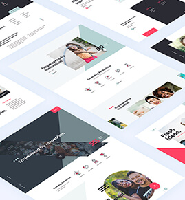
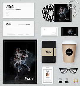
It’s taken a while. But finally Yeah Can has its first Vietnamese client for logo and web design. And it’s a great one. The full monty so to speak. Client needs from Corporate ID to brochures, power point presentations and web sites, uniforms and more. It was certainly worth waiting for.
Client is a new educational institution. Under normal circumstances it would be a non-profit organisation. But it’s not easy to set up non-profits in Vietnam. The authorities are not that partial to people’s organisations that are not controlled by the government. That’s how it is and that’s how one has to work.
The logo design came as first part of the design project. Of course as with all modern businesses the name depends on what one can find as a URL that hasn’t been snapped up by somebody else. Not that easy in the dot com world at all where short names have been scooped up long ago.
So it was decided to go with dot asia and that made it easier in the end. Besides the URL it was also important to find an image that appealed to Asia and that would work in both English and Vietnamese. It’s important to take note of local customs while staying global.
For this reason it was decided to go with the Phoenix. Strangely enough the dragon is the symbol for masculine power and the Phoenix for the female power. And that seemed to work well with the idea of education as this is a nurturing field and women tend to do that better than men.
So here are the designs for the logo in both English and Vietnamese as well as the black and white version which is to be used for documents and stationery that needs to be copied and where a black and white logo is more appropriate.
What do you think?

