Mobile Website Design – do I need it?
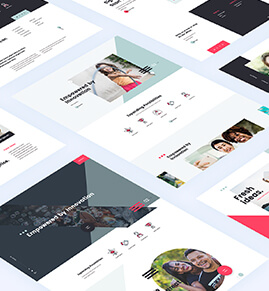
Mobile friendly websites, also known as responsive web design, are sites using fluid layout of your website that adapts to the device or gadget being used to view the website on. To test to see whether a website is responsive just adjust your browser window size to smaller or bigger and see what the content on the website does. If it disappears to the side then you know it is not mobile friendly. If it snaps into smaller blocks still showing you the content without chopped off bits, then you know it is responsive.
Facebook says that they accommodate up to 7 000 different gadgets. Hard to believe that there could be so many different mobile devices on the market. And there seems to be no end to the growth. It is vital that websites are built to accommodate these sizes or at least the most commonly used ones. In the past websites were built for the desktop computer. But now there is a fundamental shift in how people view and use the web and mobile friendly or responsive web design aims to serve this shift.
It’s first and foremost about behaviour
The web is not about big images and gorgeous colours? The web is all about users. Mobile friendly or responsive web design is all about users. For the first time in the history of the web the user and the gadgets that he uses comes first. And responsive web design reflects as much on responding to the users as responding to the gadget the user has to view your website with. The website has to serve the user first and foremost. This means that the pretty web design has to serve the usability of the website rather than be a focus by itself.
In the past web designers spent a considerable amount of time designing for the functionality and capacity of different browsers such as Internet Explorer or Firefox. With mobile gadgets using a range of operating systems the desktop computer browser is no longer the standard.
Better user experience
Mobile friendly websites have as their main focus the experience the user has. Making a website work well on mobile devices means that the user has a better experience. Of course it also means that web designers can no longer work with endless pages, endless copy and endless galleries of images. Shorter content, fewer images, less information but more relevant info is the future for the web.
Simplified everything
The user is the important focus now. This means that web designers need to consider usability and simplified navigation as the start off point. How is the navigation going to look on a mobile device. Is it easy for the users to find their way around on the website when using their mobile or are they already going to get stuck at the first screen. Do they need to scroll for ever to get to the contact details or is your navigation letting them find the important details straight away. Simplify everything.
Easy to use
Web designers work with large monitors and often with several on their desks. They paint on a broad canvas. It’s easy for them to imagine that a user will find it as easy to use the website they are designing.
However, on mobile phones where the screen is small, and there are some tiny smartphones being used, it is not that easy to find ones way around. For ease of use responsive web design reassembles the site into columns so that users do not have to scroll sideways to try and find their way around. Smartphone users are used to scrolling down though and are happy to find their information that way. Mobile friendly websites make this possible.
Bigger is most definitely better
A small screen does not mean small print. There is a trend to bold font sizes and bold graphics and also to bold and easy to use buttons. (see Windows 8 tiles and their popularity!) And there is a reason for this. It’s easier to read on small screens.
Nothing is more irritating than trying to touch a button that is too small to point at. Making the buttons bigger is the route to go. Responsive web design has pushed web design into using larger font. Easy to view and read content needs to be presented in much larger sized font than previously used. In print you can get away with size 7 or 8 font. Not in mobile friendly web design. You need to go twice that size.
Mobile friendly websites
Starting a year or so ago mobile friendly websites are here to stay. When 42% of website visitors between the ages of 18 and 25 consider their mobile phones as the primary PC then you know that it’s not just a passing fad. It’s a whole new way to view the internet and it is here to stay.


