

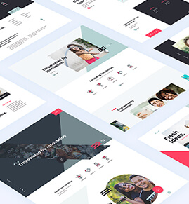
The wonders of the multitude of screen sizes. Credit: Aram Bartholi
Responsive web design
As the world goes mobile so does your website need to serve the mobile user market. No way around it. And here are some compelling reasons just in case you thought this was a fad that would pass you by if you closed your eyes and buried your head in the sand.
Quick explanation. Using responsive web design for your website means that your website will respond automatically to gadgets of all sizes by resizing itself so as to look good and be user friendly.
Reason 1: More mobile gadgets being sold than desktop computers
How is that for a mind blowing statistic. More people are buying mobile ‘computers’ than they are buying desktop computers. In fact some tech watchers even predict the demise of those grey/beige boxes. If you love stats then check here for more facts.
It makes perfect sense. Want a gadget that you can carry around with you and that seamlessly offers you information and entertainment at your fingertips? Or rather sit in front of your old PC in your home office isolated from all home activities? No brainer.
Reason 2: No App necessary
Your website will look great no matter what gadget it is being viewed on. That means you don’t need to have a separate app developed for your website to work well on a mobile gadget such as a smartphone or tablet.
Nothing is more frustrating than to have to download a tool so that you can view something. Remember the days of constantly having to update the Flash Player. It seemed everytime you wanted to look at a website that used Flash you had to go to Adobe’s website and upgrade your player.
With responsive web design nobody has to download any player or App so that your site works on an iPhone or Galaxy. It just works seamlessly. No matter what you use to view the website with.

Responsive Web Site for L R Associates
Reason 3: No additional expense for App development
Besides the irritation to your users of having to download some extra bit so that they can view your website what about the cost you are saving yourself by actually creating a website that works on a smartphone no matter what size the screen is.
Cost savings could be quite substantial. Not having to spend a couple of thousand dollars on an app could mean having some money for online marketing rather or even perhaps a holiday with your family. Cost saving is always a bonus.
Reason 4: Keep your users happy
Visitors to websites have a notoriously short attention span. A second or so is all you have. So why make their visit a bad experience. Your visitors will leave quickly if the website doesn’t work on the mobile gadget they are using.
It’s not only the fact that visitors leave quickly that is a worry to website owners. The other problem is that 42% of visitors won’t come back if the original visit was not pleasant. They would rather go to your competitors. Not good at all.
Reason 5: Better search results
Google loves Responsive Web Design and have named it as standard or best practice. Responsive design sites have one URL and the same HTML regardless of what devise is visiting the site. It’s therefor more efficient for Google to crawl, index and organise content. And content is all on one URL. The main reason though is that users prefer it. And that’s what Google is always working on. What do people want.
Don’t wait go responsive web design
If you haven’t considered it as yet, then do so now. Your web site needs to be responsive. And the above provides you with five really good reasons to consider the move. Speak to a good responsive web design developer to make sure your website speaks to all gadgets that your visitors are using.