

Consumers are using their mobile devices to view the internet.
Getting a new website
You need a new website or need to upgrade an existing one? What do you need to take note of before starting on this project. Has anything changed? Not really. The internet, from a consumers’ perspective, has not changed much.
Sure we have quicker feeds to our devices. Team Yeah Can has 100MB internet service. Unheard of a few years ago. And the cost has come down as well with free WiFi zones scattered around in public spaces. But that’s not it.
Where is the shift then?
Where the real shift is is how we consume the internet. And this shift is monumental. So far it hasn’t really sunk in as yet. Individuals and businesses using the internet to promote their service or product still believe their consumers are using desktop or laptop machines to use the internet.
Not so. Here’s what’s happening.
Fact 1: Consumers are changing habits
This is where the biggest shift is happening. 42% of smartphone owners between the ages of 18 and 29 consider their phone as their primary way to access the internet (Pew study). Of course this is a statistic appropriate for countries such as the USA and UK where smart phone uptake is rapid.
However, do not underestimate the speed and world wide spread of smartphone uptake. And we are not even talking about tablets yet.
Fact 2: Mobile devices are not standard
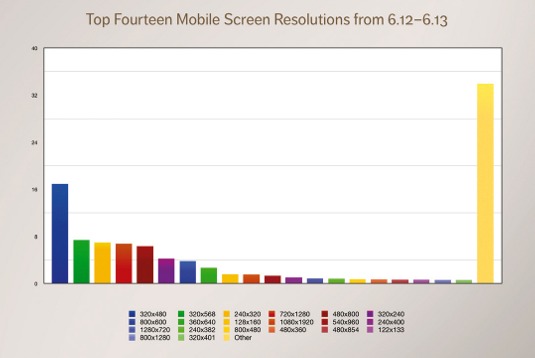
No standard mobile screens or screen resolutions
With so many devices that may be used to view the internet, the numbers of screen sizes are as varied. In fact there is no one screen size or screen resolution that dominates the market. For web developers this means there is not one most commonly used size that one can focus on.
Fact 3: It’s the smartphone or nothing
There is no fall back. The scary fact is that it’s either smartphone for the internet or nothing. That is this age group of 18 to 29ers don’t grab a quick desktop computer if the site doesn’t work on the phone. They leave! They look for a site that caters to their device.
What are your options?
Your option is to make sure your website is responsive. There is no quick fix though. Your website will need to be redesigned to be responsive. In any event you should update your website every two years. If your business hasn’t changed in that time you are probably not going to be around that much longer. And if it doesn’t matter what’s on your website then you might as well save yourself the hosting fee and take it down.
Don’t listen to people who advise you to get a quick App to run on phones. This is not really an option for you. Well designed and functioning Apps that run on the most common smart phone operating systems are expensive to make. Rather spend the money on a good web designer who can create a website for you that can work on mobile devices as well.