
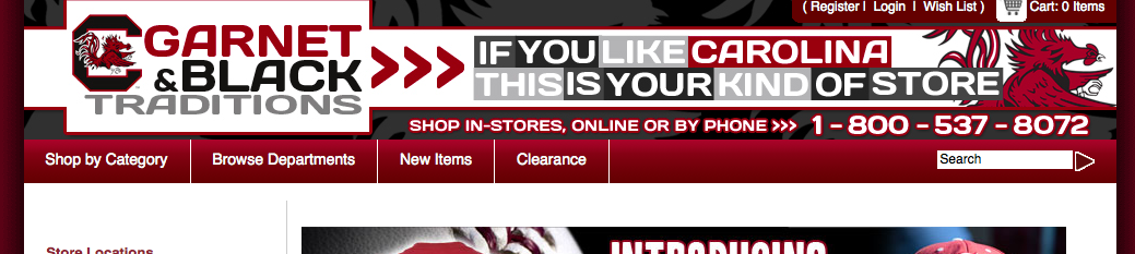
Garnet and Black Traditions
Leaving m-commerce for responsive web design!
Traditionally online stores developed a smartphone app to provide an easy to use platform for their shoppers to use when visiting their store with their iPhones or Galaxy mobiles. Visiting their sites with a smartphone automatically offered you the download of the app. The app would then lead the user to a mobile only website or m-commerce site.
Enter Garnet and Black Traditions, an e-retailer of University of South Carolina Gamecocks merchandise. Their ditching of their m-commerce site in favour of a responsive web design site could possibly be signaling the start of a new trend.
Developing in stages
The main focus of this redevelopment by Garnet and Black was to accommodate smartphones. They redid their m.GarnetAndBlackTraditions.com using responsive techniques which they plan to apply at a later stage to their main site. In this way one website or online shop will accommodate all sizes.
It’s a clever move to rework the site using more manageable steps. In this way it is also possible to iron out problems and improve usability on only one section of the target market eventually accommodating all user on one singe platform that adjusts to the user’s gadget.
What effect has this had
So far this move to responsive web design has proven to be the right move. First figures out have shown that the conversion rate of mobile shoppers has increased dramatically. Pre responsive the conversion rate was 3.21% and sales accounted for 7.51% of total web sales.
Today the mobile conversion rate is 5.83% and mobile sales account for 18.25% of total web sales. Feed-back from the company’s e-commerce director attributes this gain to the fact that users like to have consistent features on a website. A mobile app will offer vastly differing navigation for instance on the app. This confuses visitors who prefer to learn one system that they can use across all of their computer gadgets.
Creating a uniform user experience
We are creatures of habit. We like our newspapers in the same format so that we can pick up any and quickly find the sports section. We love our grocery stores to keep the same lay-out so that we know where our favourites bits are. Change the road so we have to take another turn to get to work? Not allowed to do that. And so the list goes on.
We want our experience to be the same or at the least very similar. When we want to shop online we don’t want our experience to be a confusing and frustrating time. After all there are so many competing stores online. We can easily find one that serves us right as customers.
Don’t make that mistake when considering your e-commerce website. Responsive web design could be the solution you need in order to make your customer’s experience a great one. Can only lead to sales!