The Myth about Above the Fold
Thank you to Luke Wroblewski for the content for this blog post. View the original here. It’s something web designers get instructed to do almost daily. Place the Call to Action button way above the fold because this is where visitors will see it and react to it. Wrong.
Placing a Call to Action above the Fold
His succinct response to some queries on his slide show about the question of what people do when they land on a page and where one should place ones Call To Action were as follows:
This goes go well beyond the question of “do people scroll or not?” People use the notion of “above the fold” to validate calls to action, engagement, design layout decisions and more. Here’s why each of those don’t fly.
1) placing elements at the top of the screen does not guarantee they are visible because people often scroll. So just because it is “above the fold” does not mean it gets noticed. This data speaks to that:
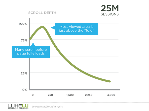
Most focus on the page by visitors.
View also on: http://twitter.com/lukew/status/541986091960528896
2) If you are assuming people engage above the fold as a lot of design literature will tell you: http://www.nngroup.com/articles/scrolling-and-attention/
You’re likely wrong, more engagement happens right at and below the fold than above. that’s what this data speaks to:
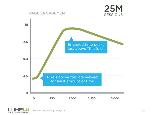
There is no above the fold
View original here :http://twitter.com/lukew/status/541986175414575104
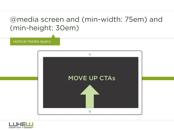
3) If you’re assuming the best way to drive conversion is to put big buttons above the fold, you’re missing out on the more important point of placing actions where people become convinced to act (this is key). That’s what this data speaks to:

Place the CTA where you will get a response
Original also here http://twitter.com/lukew/status/541986443598393345
4) There are design/development techniques that allow you to reposition content based on screen size. So if you do want elements visible on screen regardless of size, you can. This is “fold independent” layout. This video illustrates some of these techniques:
Where to place the CTA
Original also here http://twitter.com/lukew/status/542002504477573121
5) today’s device ecosystem renders any concrete “fold line” moot. there’s just too much variety in screen sizes. That’s the point this data makes:
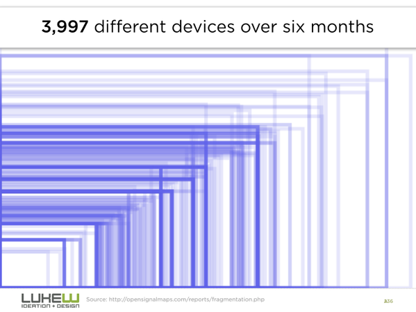
Screen sizes.
View original here http://twitter.com/lukew/status/542002569392844801
Therefore designing in an adaptive/responsive manner (like in the techniques above) is required.
On the subject of scrolling alone. Yes, your layout can make it look like there’s nothing to scroll -not good. This image speaks to that:
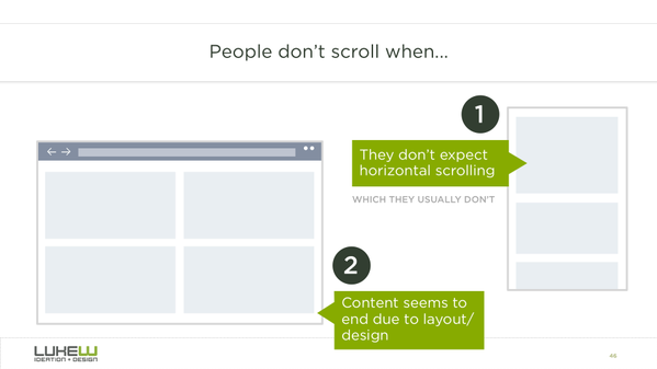
No scrolling?
Food for thought for all web designers and their clients.